Sunday, October 5, 2008
PRINT+
Thursday, September 25, 2008
LASKAR PELANGI!
Tuesday, September 16, 2008
Wednesday, September 10, 2008
Wednesday, August 27, 2008
Penilaian BLOG

Siap-siap untuk final blog, kriteria yang jadi penilaian saya adalah:
1. Kelengkapan (artikel, label, adsense, header, picture, intro dll.)
2. Estetika - design header-nya yang bagus, kalo jelek nilai dikurangi.
3. Keseluruhan - flow keseluruhan blog-nya.
Jadi yang headernya masih kosong, cepetan di desain yang bener. Jangan mepet.
Yang masukin picture jangan overkill, sampe lieur, yang pas aja.
Saturday, August 23, 2008
F.L.A.P Photo Trial: DONE!
Tuesday, August 19, 2008
Get READY to RUMBLEEEE!!!!
Wednesday, August 13, 2008
Privacy Policy
If you require any more information or have any questions about our privacy policy, please feel free to contact us by email at xxxxxxxxx@gmail.com.
At www.graphic-1.blogspot.com/, the privacy of our visitors is of extreme importance to us. This privacy policy document outlines the types of personal information is received and collected by www.graphic-1.blogspot.com/ and how it is used.
Log Files
Like many other Web sites, www.graphic-1.blogspot.com/ makes use of log files. The information inside the log files includes internet protocol ( IP ) addresses, type of browser, Internet Service Provider ( ISP ), date/time stamp, referring/exit pages, and number of clicks to analyze trends, administer the site, track user’s movement around the site, and gather demographic information. IP addresses, and other such information are not linked to any information that is personally identifiable.
Cookies and Web Beacons
www.graphic-1.blogspot.com/ does use cookies to store information about visitors preferences, record user-specific information on which pages the user access or visit, customize Web page content based on visitors browser type or other information that the visitor sends via their browser.
DoubleClick DART Cookie
.:: Google, as a third party vendor, uses cookies to serve ads on www.graphic-1.blogspot.com/.
.:: Google's use of the DART cookie enables it to serve ads to users based on their visit to www.graphic-1.blogspot.com/ and other sites on the Internet.
.:: Users may opt out of the use of the DART cookie by visiting the Google ad and content network privacy policy at the following URL - http://www.google.com/privacy_ads.html
Some of our advertising partners may use cookies and web beacons on our site. Our advertising partners include ....
Google Adsense
Commission Junction
Widget Bucks
Adbrite
Clickbank
Azoogle
Chitika
Linkshare
Amazon
Kontera
These third-party ad servers or ad networks use technology to the advertisements and links that appear on www.graphic-1.blogspot.com/ send directly to your browsers. They automatically receive your IP address when this occurs. Other technologies ( such as cookies, JavaScript, or Web Beacons ) may also be used by the third-party ad networks to measure the effectiveness of their advertisements and / or to personalize the advertising content that you see.
www.graphic-1.blogspot.com/ has no access to or control over these cookies that are used by third-party advertisers.
You should consult the respective privacy policies of these third-party ad servers for more detailed information on their practices as well as for instructions about how to opt-out of certain practices. www.graphic-1.blogspot.com/'s privacy policy does not apply to, and we cannot control the activities of, such other advertisers or web sites.
If you wish to disable cookies, you may do so through your individual browser options. More detailed information about cookie management with specific web browsers can be found at the browsers' respective websites.
Tuesday, August 12, 2008
First day of Class
First of all, I want you to read the CLASS RULE and the GRADING system posted on the right navigator. Do not forget to read MDKV 3 under DKV Maranatha. This Thursday, your job is to came up with the name and theme for your blog and do not forget to register to Gmail, Blogspot / GooglePages, Adsense and Picasa Web Album. Please bring some sketches for the Title Banner.
See ya on Thursday.
Sunday, August 10, 2008
The Ultimate Guide to Designing with Black

Black is just black, right?
In the world of web where you’re designing for the screen black is black, zero amounts of Red Green and Blue. There are no hidden gremlins to catch you out (apart from those percentages of people with the brightness and contrast levels completely out of sync on their monitors!)
When designing for Print however, the four colour CMYK process is used, where K (key) is the black ink alongside Cyan, Magenta and Yellow. But, there’s slightly more to it than that!
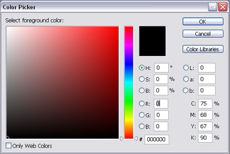
Selecting Black in Photoshop
The default black setting in Photoshop is not ideal for print. Open up the colour picker and select the black you are used to using on a daily basis, look closely at the CMYK values and you will notice it is made up of:
Cyan – 75%
Magenta – 68%
Yellow – 67%
Black – 90%
There are three main problems this could cause:

Issue one, importing into Illustrator or InDesign
Let’s say you have created the above image in Photoshop using the default black, and you want to place it into your InDesign or Illustrator design document on a black background.

You open up the InDesign or Illustrator package, draw the square on the artboard, fill it with the black swatch and place the artwork onto it. All looks good and it goes to print.
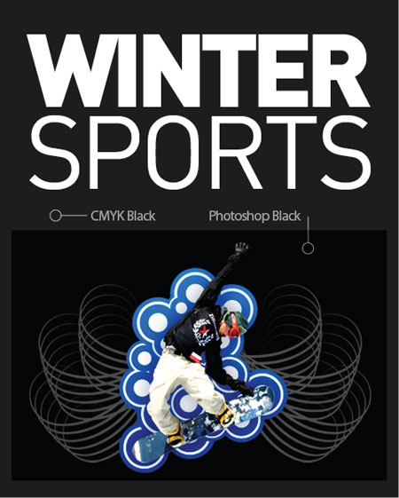
What you didn’t expect is that it would come back looking like this on all 1000 copies of your printed designs! The reason for this is that the default Photoshop black is made up of a mix of all four colours as mentioned above, whereas Illustrator and InDesign use the correct swatch of 0% Cyan, 0% Magenta, 0% Yellow and 100% Black. As you can see these two versions produce very different results.
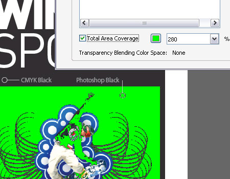
Issue Two, total ink coverage is 300%
Export your design as a PDF as use the Adobe Acrobat Output Preview tool to check over the file, if you turn on the Total Area Coverage option it will highlight areas with over 280% ink coverage as a potential overinking problem.
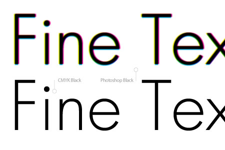
Issue Three, fine text will become fuzzy and illegible
If you have created text in Photoshop with the default black colour, particularly small typesizes or fine serif fonts, chances are they will return from the printers as very blurry or fuzzy and possibly missing any fine areas of type.
The reason being the four sets of ink are being placed over the same area, along with any slight mis-registration causes a loss of detail mostly noticeable on these fine areas.
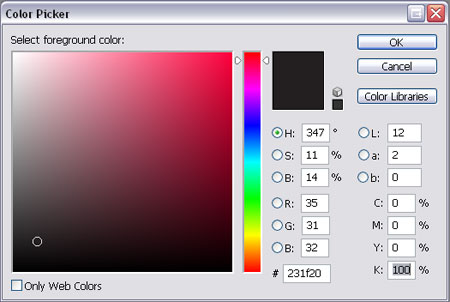
The solution for all three problems is to ensure you always select the correct black in Photoshop by entering the appropriate numbers in the Colour Picker.
Cyan – 0%
Magenta – 0%
Yellow – 0%
Black – 100%
By entering this combination you are specifying that you only want to use 100% of black and none of the other colours for this area of colour, resulting in the single pass of ink on this area.
CMYK Black Is Not Quite Black
CMYK black, or the 100K mentioned previously is great for text, allowing for a crisp and sharp reproduction. On large areas of flat black however, 100K doesn’t really have much impact as black, more as a dark grey, especially when uncoated.
The solution to this is to add a little extra colour to the mix, this is known as creating a Rich Black. The two most common Rich Blacks are those adding Cyan or Magenta.
Rich Cool Black
Cyan – 40%
Yellow – 0%
Magenta – 0%
Black – 100%
Rich Warm Black
Cyan – 0%
Magenta – 40%
Yellow – 0%
Black – 100%
There are many more variations floating around, including 60% rather than 40% and some using a combination of all four colours.
Rich Black should ideally only be used on blocks of black and large titles as the two coats of ink will cause the problem outlined in issue three above on normal sized text.
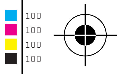
Don’t Ever Do This
One point to remember is never use Registration Black on anything apart from printer’s marks such as crop and registration marks. Registration Black is a 100% mix of all four inks and should not be used at all on content items, artwork containing registration black would likely be rejected by the printer.
The Five Blacks Summarised
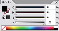
CMYK Black – 0C 0M 0Y 100K
The ideal black for text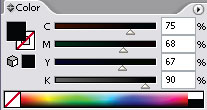
Photoshop Black – 75C 68M 67Y 90K
Rarely used, sometimes called upon as a form of Rich Black.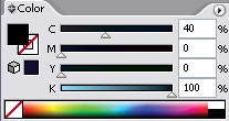
Rich Cool Black – 40C 0M 0Y 100K
Rich black with a slightly cool blue tint.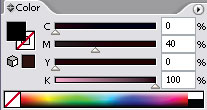
Rich Warm Black – 0C 40M 0Y 100K
Rich black with a slightly warm red tint.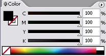
Registration Black – 100C 100M 100Y 100K
Used only for crop and registration marks.
Thursday, July 10, 2008
20 Ways to Avoid Creative Block When You are a Graphic Designer
by Blake Phillips - Art Director - Vibra Design
As a designer everyone has experienced a point where they just can no longer think of anything worth while. It’s in these situations when you have to reevaluate your perception of what works and what doesn’t. Use the following 20 tips to avoid and get through a tough designer's block.
1. TAKE PHOTOGRAPHY

Almost all graphic designers have a camera with them, so why not use it? Can’t find that perfect texture or color? That’s fine, go out and take a picture of what you need. You may find inspiration in a very uncommon place. Be sure to take plenty of pictures, not just a few, then return to your office and review them to recall special feelings or smells from those memories.
Huge List of Free Stock Photography on the Net
2. CALL A FRIEND

Sometimes all it takes is a friend to say something worthwhile. Call your friend(s) and discuss past events to help you recall something enjoyable, being in the right set of mind is what it’s all about, and friends bring you out of the “working mode” and into a much more pleasant frame of mind. Remember not to call them and interrupt them when they are at work as it may work the opposite way in that case.
3. FLIP THROUGH DESIGN BOOKS

There are a ton of books out there that were made just for people that have designer’s block. The authors of most of these books have compiled huge amounts of graphi design work into one comprehensive picture book. These are often sorted to help you find a specific idea or theme. Just don’t underestimate the power of any ole' books, even novels, comic books, and short stories can also help get you out of slump. Here is a great list of graphic design books.
4. READ TUTORIALS

Most tutorials are out there for people who want to learn about design, layout, graphics and illustration software, but for graphic designers it can also be used to brush up on old techniques or to see the newest trends. These sites also often contain links to samples of how the tutorial was used in context of an actual design piece. With the latest design suites, it’s often impossible to learn every new feature of a new software and these tutorials can also help show you what it new and useful with a software update. Here is a huge list of Tutorial Sites.
5. VISIT INSPIRATIONAL WEBSITES

It’s almost a given that you know about a whole range of inspirational sites that you frequent for ideas. However, going into these sites is almost a guaranteed way to break a difficult graphic designer’s block. Also, don’t go to the same inspirational sites all the time, but instead try to find new ones, as the process alone could spark the idea of what you were looking for. Here is a great list of 180+ of the top sites that list inspirational designs.
6. CREATE ART FOR PERSONAL USE

The key to staying sharp and up-to-date is to frequently produce art for just yourself. Practicing is really the key to perfection. Not only will you become more proficient with design software, but you will also come across new ways to do the same thing, in turn creating something entirely new and unique. Use these personal projects in your office to recreate those techniques for a client.
7. SPEAK WITH COLLEAGUES

Not everyone will be able to do this as many of the readers of this article are freelancers. But if you are in an office environment, speak to colleagues when time permits and if they’re not busy. Often you can have small quick brainstorming sessions that may help you to open your mind to a new focus. Colleagues can also help to relieve a lot of tension and stress built of from not being able to think about new designs ideas. If you don't work in an office environment, you probably have online peers who are also designers. Chat, skype, or email them to ask for help or to just talk.
8. WATCH A FUNNY MOVIE OR VIDEO

Laughter is truly the best medicine. Whether it is within a group or by yourself, laughter will help relax you and has been thought to stimulate current parts of the brain that control a person’s artistic and cognitive abilities. Use this fact to your advantage and don’t be afraid to really let it out. A few chuckles is good, but a real good “knee-slapping” laugh is even better.
9. DOODLE IN A SKETCHBOOK

All graphic designers doodle as it’s a habit that you have probably been doing since you were in school instead of listening to your teachers. Doodling can often help you focus and think freely. Instead of trying to create something with a purpose, you simply let your mind create something. Forcing creativity can often drain a graphic designer quickly of any good ideas they might have had. Sometimes it is just better to just let everything go and draw freely.
10. LISTEN TO MUSIC

Music is food for the soul, and also a graphic designer’s mind. You may find that listening to certain types of music may cause you to design a certain way, whether it be hard rock to create a grunge design, or acoustic jam for those soft elegant designs. Use the mental “flow” you get from music to your advantage and it will set up your entire session. Something even better is if you are a musician, step away and play some music. All the same rules apply except that it sparks a creative part of your brain and will help get rid of that nasty designer's block.
11. FIND A SEPARATE HOBBY

Being on the computer all day long, everyday, can be excruciating. Don’t let it happen to you. Instead, find a hobby that has absolutely nothing to do with graphic design or being creative or artistic. Hobbies such as fishing, camping, collecting, billiards, chess, or working out are great ways to relax your mind. Trying to be creative all day is too stressful and you will quickly burn-out as you need a way to completely step away sometimes.
12. TAKE A STEP OUTSIDE

Probably the most widely used method of trying to get rid of designer’s block is to just to take a quick stroll outside. The problem lies within us. Most graphic designers step outside expecting ideas to come out of them. In other words, by doing that, you are not taking a break. Just step outside, smells some fresh air, listen to the birds, and enjoy the feeling of just being with nature. Ignore everything except what you can see, smell, or hear. Then you can step back into your office and feel refreshed.
13. WRITE POETRY OR PROSE

Often as a graphic designer you run across an idea or phrase that gets stuck in your head. Use that, write a short poem about it. Flex those verbal muscles. Language is within a different part of the mind that thinks about words so you can work them hard and it will still let your design muscles rest. This is a way to get rid of designer’s block and plays very nicely into the next method.
14. LOOK UP SYNONYMS OR ANTONYMS

In your quest to write an amazing piece of literature, you may find that you lack a correct way to say something. When this happens, you should use a thesaurus. Finding related words will often help you look at the same thing with a different spin, and finding antonyms can help you narrow your ideas. Maybe buy a “word-a-day” calenda. This is a great way to keep your vocabulary fresh and they are also pretty good conversational pieces.
15. GO FOR A DRIVE

If weather permits, go out to your car, roll down the windows (or sunroof), and just take a cruise around the countryside or within the heart of the city. Just try to drive somewhere you don’t normally go, find new back roads, or get lost somewhere. Listen to some music while you are driving as well, it’s a win-win situation really, but just make sure you don’t get too lost, you’ll eventually have to come back to the office.
16. VISIT THE LOCAL COFFEE SHOP

Yes, that means Starbucks too. Coffee has caffeine and as most people know, caffeine can help stimulate the brain (when used in small quantities). However, don’t sit inside the coffee shop, but rather sit outside and enjoy the weather and bring a pencil and paper as well. Use the sights and sounds to help sketch out ideas for your design and you will find that you can think better if you are not really trying to think at all. In addition to all of that the caffeine you are drinking, you should focus your mind on a particlar thought. Just don’t drink caffeine in excess as it can lead to addiction with many nasty side-effects.
17. WORK IN PUZZLE BOOKS

These little workbooks are great and using them will increase your focus and help you process thoughts and ideas more effeciently. Solving problems is the job of a graphic designer and anything you can use to help with your problem-solving abilities is a must. There are also puzzle books that will help with proof-reading and error-checking as graphic designers need to have the ability to check over their own work and notice small differences with shapes and colors.
18. SLEEP ON IT

Sleeping does many things, such as increases energy, enhances focus, and helps memorization (just to name a few). It helps graphic designers by allowing them to think about something without actually thinking about it. Most of the time, coming back to a design layout the next morning is the best way to look at something with fresh eyes. You will also find that you can judge your work much better with a fresh look at your design. It will also help you determine if it still portrays the message the way that you had wanted it to. Naps are also another way. Eat while you are working and use your lunchtime to take a nap in the car. You will find that this helps boost your creativity a noticeable amount.
19. LOOK FOR INTERESTING OR NEW FONTS

Finding fonts is a pretty fun thing for graphic designers as it creates this sense of “What can I use this for?” in their mind. Fonts spark ideas for layouts and sometimes designers actually base an entire design on a font that they have found. Also, most really creative fonts include design elements within the lettering and ligature that can be used in an entire layout as shapes and backgrounds. make sure sure you have a good font management program as well as your font collection can get pretty big. Here is a humongous list of free font sites.
20. STRAIGHTEN UP YOUR OFFICE

Having a clean environment is very conducive to your creativity. Clutter across a desk is the same as cluttering your thoughts. Organize your desk and your mind, file away old projects, put together doodles into one folder, keep hard-copies of all work on the wall or desk, and just get comfortable. Which brings up another point ... working in an ergonomic environment. Try not to sit too far away, above, or below your keyboard and monitor, make sure your monitor has the correct refresh rates and resolution, your chair should have proper lumbar support as well as plenty of cushion, and have lighting other than flourescent bulbs.
Remember this, if you are going to try any of these techniques, do not perform them expecting positive results every time. The trick is to really let your mind wander in different directions, because if you are trying too hard to be creative, then it will never work.Tuesday, July 8, 2008
3 Things I thought I knew about photo marketing and becoming a professional photographer - boy was I wrong!
Back when I first decided to become a professional photographer and get involved with photo marketing on a full time basis, I thought - foolishly - that all I had to do was practice and study all the latest techniques for creating stunning images! Then, once I learned to consistently do brilliant work, my career as a professional photographer would be more or less cast in stone.
Boy was I wrong! If you want to earn great money in photo marketing (I've lost count of how many $1000 days I've had) by becoming a professional photographer and working in the career of your dreams - here are 3 vital things you NEED to know. BTW - you can and should start part time!
First, let me establish a few assumptions on my part. I assume you are interested in photography and that you have dreamed about working in a career that you love.
I also assume that you are either considering/dreaming about becoming a professional photographer or possibly have already tried your hand at photo marketing - at least part time.
Note: I didn't assume you are a brilliant photographer. That was the first huge hurdle I faced when I wanted to start my photo marketing career. I just wasn't that good. I was and still am competent, but I don't see myself ever winning any major creative awards.
I'd shoot and shoot. Remember - this was in the olden days of film, when every shot cost about a dollar after considering time, film, developing and printing costs. No matter how much money I pumped into my "hobby", no matter how many credit cards I maxed out buying the latest and greatest, I just couldn't measure up to the photos I was seeing in all the photo books and magazines.
My dreams of a career as a professional photographer seemed totally out of reach.
Wrong. That's myth #1. You don't need to be Ansel Adams! Just competent!
I don't remember where, but somewhere I stumbled across someone who said, "There's room in professional photography for every skill level."
That sentence changed my life. I'd buy the originator of that little snippet of gold a beer, if I could remember who it was.
For some reason, it really hit home and I decided to give photo marketing a try. Bottom line�I found out that 90% of all your photo shoots are going to be the same types of subjects, lit and posed the same basic ways.
Don't get me wrong, every session you do should be your absolute best work, but save the creative stuff for contests - not day to day photo marketing. (Actually, if you are too creative, your sales will drop. The clients expect traditional portraits and don't like it if you deviate very far from their expectations.)
My second major hurdle to getting started as a professional photographer was getting the money to open a studio. After all, rent is fairly expensive and when you add in decorating the space, signage, hiring a receptionist, utilities and all the other doodads involved in opening a physical studio - it can all be rather daunting. Particularly when you've never done any photo marketing and this dream of becoming a professional photographer is getting more and more expensive by the minute.
Before I launched my photo marketing career, I did a little research and discovered that the best professional photographers do a lot - if not most - of their work "on location"! In other words, they aren't even using the studio! Plus, their customers were so happy the photographer was coming to them, they were willing to pay extra!
So I said to myself, "I can pay a ton of money for a studio I won't be using, or simply do everything 'on location' and get even higher fees! Hmmm�what should I do?"
I've been a professional photographer for over 16 years, have over 6000 past clients and have NEVER opened a studio.
Myth #2 - You need a fancy studio to be a professional photographer. WRONG.
Myth #3 - As a professional photographer, once people see your stunning images they will flock to you with checkbook in hand! WRONG, WRONG, WRONG.
Sorry to say it but your images have little to do with your success as a photographer. It's all about your marketing. Once you get your marketing right, people actually will be clamoring for your services, but not before - no matter how good you are.
In fact, many of my best promotions get new customers lining up to be photographed without ever having seen any of my work at all! So, if photo marketing and living your life as a professional photographer sounds even a little intriguing, respond by enrolling in my http://www.PartTimePhotography.com newsletter. You'll get a free ebook and daily tips on how you can turn your dreams into cash.Reprinted from valuablecontent.com
Saturday, June 28, 2008
End of The Road
Ada masa hepi-hepi ada masa susah-susah, selamat buat yang udah lewat dari kelas saya.
Buat yang masih belom, semoga bisa berusaha lebih di semester depan, soalnya biasanya yang ga lewat kelas saya sih yang kurang niat proses kerjanya.
No hard feeling, saya tidak menilai kepribadian kamu dengan nilai di kelas saya, tapi kalo proffesionalism sih buat saya segitu sih kurang.
Kalo diri sendiri merasa, "Kok gue sekola ga niat-niat amat yah?" mening mikir-mikir lagi apa emang kamu bener berada di FSRD, jangan buang waktu untuk sesuatu yang tidak kamu cintai.
Temen saya aja ada yang perjalannya dari design - filsafat - akhirnya ternyata cocoknya di kedokteran, nah loh! Introspeksi diri, kalo belom ketemu minat kamu apa, cari terus jangan menyerah.
May the Force be with you!
Kalo kata Lao Tze juga - Wu Wei - alias hidup sesuai dengan kodrat alam.
Wednesday, June 18, 2008
Boardgame Bandung
boargamebandung.blogspot.com
Adios!
Internship
Male: Yoshua Prawira
Female: Shelly Diana
I am terribly sorry because I can't have everyone as an intern, sooo.... one male and one female.
Thank you.
Tuesday, June 17, 2008
More Website!
Talak Class A: Completed!
Di kelas Talak Senin sudah ada yang saya Failed-kan karena memiliki standard kerjaan yang tidal memadai.
Perlu diketahui bahwa saya tidak akan segan untuk mem - Failed - kan murid yang memiliki mutu dibawah standard karena, akan sangat tidak adil buat yang telah berusaha keras. Masa yang kerjanya santai bisa lulus dengan mudah, kalo gitu buat apa kerja keras?
Buat yang hari Jumat siap-siap, jaga KERAPIHAN, ini nilainya besar sekali buat saya.
Good Luck!
Tuesday, June 10, 2008
TaLak!

Okay ini minggu terakhir buat Talak, siap2 untuk FINAL!
Jangan lupa bikin layout concept untuk foto kamu!
Nanti sesudah presentasi kamu ke ruang foto untuk motret kerjaan kamu.
Yang dipotret: Stationery System, Business Plan & Collection Piece
Yang Motret: Kelas A - Diego Armano & Kelas G - Billy the Kid
Jangan lupa lagi, tolong bikin yang RAPI!!! soalnya presentasi nilainya SANGAT BESAR!!!
Juga JANGAN TELAT!!!, ini juga termasuk dalam nilai presentasi.
Good Luck!
Poster Tipografi

Okei buat yang udah poto2, nih spesifikasi kerja untuk bikin posternya.
Ukuran: A2
Konsep: Bebas
Warna: Bebas
Huruf: A-Z (huruf besar)
Angka: 0-9
Poster dibikin simple aja yang penting rapi en keren, nih saya kasih contoh.
Thursday, June 5, 2008
Handy Craft!
Tipografi 1
Tuesday, June 3, 2008
Typography Next Photo Session!
CIHAMPELAS. Kita kumpul di J-Co jam 9an ok. Ini sesi foto terakhir. Jadi kalo kurang tolong dilengkapi sendiri abjad en huruf-nya.
Syarat dan ketentuan:
- Ga boleh huruf dalam bentuk apapun (patah, rusak, dll.)
- Ga boleh gambar atau hasil cetakan dalam bentuk apapun (bentuk harus alami)
- Kalo bisa huruf BESAR semua.
- Boleh dijadikan hitam putih atau sephia.
- Kalo bisa ada TEMA ada nilai tambah.
- Terakhir dijadikan poster ukuran A2 ditempel ke cardboard.
Talak Class A: Final Days!
Armand: You're Back! kamu sempat menjadi anak yang hilang, kini kamu sudah kembali, hiks. Ada ide buat cover: mungkin kamu bisa bikin conversation di cover misalnya.
Balon 1: Que? Bussiness Plan?
Balon 2: Si! (Logo) Los Reklamos!
Jeffry: Kamu layout paling kuat, tinggal diberesin. Kalo bisa covernya udah mulai di test supaya ga kelabakan kalo gagal. Kalo bisa cover diberesin malah, soalnya kan tinggal di tempel ke content.
Ompong: Peningkatan, jauh lebih mening daripada project 1. Test warna dulu jangan sampe kaya sebelomnya, warna abunya jadi aneh.
Nelson: Skill merata (in a good way), konsistensi lumayan. Kamu isi-nya cepet beresin, soalnya look and feel-nya udah dapet. Coba di gambar koin collection piece dikasih subliminal message, misal: tulisan "BAYAR" yang sangat tipis tapi orang ga sadar kalo liat MWAHAHAHAHa (evil laugh).
Adi: Cover-nya mulai di test juga, layout juga udah lebih baik. Coba benerin project 1-nya soalnya kan logonya agak rubah.
Edwin: Grid masih ada yang ngaco, layout udah rapih tapi masih boring zzzzzz..... sering2 liat buku design.
Andre: Layout udah mayan yang terakhir tapi saya belom liat lagi perkembangan-nya.
Pemuda Y: (speechless...)
Isi minggu depan udah harus lengkap, collection piece udah harus ada konsep dan minimal sketsa-nya.
Tambahan: bikin konsep untuk pemotretan projek kamu biar bisa masuk portfolio. Soalnya kata saya sih projek ini cukup layak untuk masuk.
Ok segini untuk kelas A. Good luck! You can do it!
Wednesday, May 21, 2008
PART TIME FLEXIBLE JOB!
Bantu saya untuk melakukan proses eksplorasi desain dan dapatkan bayaran IDR 10.000,- / jam
Karena saya sering manghabiskan waktu untuk bertemu dengan klient, meeting dan main. Saya ingin memangkas waktu kerja desain saya. Saya sangat menghargai sebuah karya desain yang memiliki concept atau content yang kuat, bukan hanya bagus saja. Saya percaya sebuah desain yang baik memiliki tingkat eksplorasi yang dalam dengan dibantu research yang lengkap.
Yang saya perlukan:
- Orang yang dapat mengumpulkan data research untuk saya baca.
- Orang yang dapat melakukan eksplorasi desain dengan sketsa.
HOW IT WORKS
Saya akan nge-post tawaran kerjaan di blog ini (jadi sering2 cek) dan akan memilih tiga(3) orang pertama yang me-reply post saya. Baca permintaan yang saya pasang di post dan jangan lupa deadlinenya.
Saya hanya akan memilih satu orang dari tiga di atas untuk dibayar. Jadi pastikan hasil karya kamu sesuai dengan waktu yang kamu gunakan untuk menghasilkannya.
Tolong diberi comment tentang hal ini, apakah pada berminat atau tidak.
Wednesday, May 14, 2008
Wejangan Berkhasiat
- Harus bisa terima kritik, kalo engga kamu bisa sengsara pas kerja. Kamu pernah ga di kritik klient yang ngomongnya kaya ke pembokat sendiri? Saya sih pernah, jadi jangan sok perfect sampe kerjaan aja di-kritik ga mau.
- Kalo saya kasih saran untuk desain, trus ternyata hasilnya jelek, ya jangan dipake. Kalo masih dipake kan saya jadi mempertanyakan design sense kamu. Apalagi kalo udah jelek nyalahin saya. Wew. Dibantuin kok malah gitu, saya jadi males bantunya laen kali.
- Kalo ga mampu ambil kelas banyak2 ya nyantai aja jangan maksa, buat apa kalo nanti kelasnya gagal juga. Biasa sih 4 kelas desain udah cukup mumet. Kalo bisa ambil 3 aja trus satu laginya jangan kelas desain. Yang penting portfolio bagus, nilai mah ga ada hubungan kalo kerja di desain.
- Sambungan dari no 3, time management. Kalo mau maen ya jangan ambil kelas banyak2. Kalo mau ambil banyak kelas ya jangan maen. Gitu aja sih simple.
- Penilaian saya terhadap nilai kamu berbeda dengan penilaian saya terhadap kamu sebagai individual. Jadi tolong kalo saya kasih jelek jangan berpikir saya ga suka sama kamu, saya cuman ga suka sama kerjaan kamu.
- Mengulang kelas bukanlah hal yang memalukan, saya juga pernah kok gagal kelas. So what?, yang penting saya sekarang udah bisa. Kalo kamu bisa perform bagus, ga akan ada yang liat ke masa lalu kamu lagi.


