

Black is just black, right?
In the world of web where you’re designing for the screen black is black, zero amounts of Red Green and Blue. There are no hidden gremlins to catch you out (apart from those percentages of people with the brightness and contrast levels completely out of sync on their monitors!)
When designing for Print however, the four colour CMYK process is used, where K (key) is the black ink alongside Cyan, Magenta and Yellow. But, there’s slightly more to it than that!
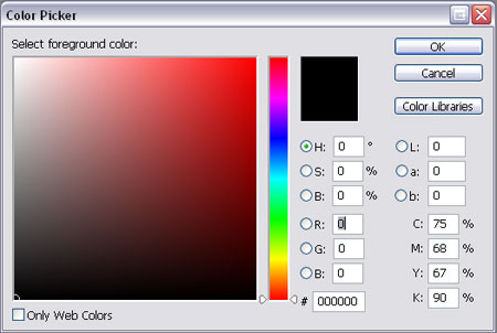
Selecting Black in Photoshop
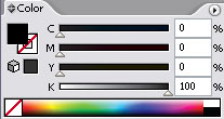
The default black setting in Photoshop is not ideal for print. Open up the colour picker and select the black you are used to using on a daily basis, look closely at the CMYK values and you will notice it is made up of:
Cyan – 75%
Magenta – 68%
Yellow – 67%
Black – 90%
There are three main problems this could cause:

Issue one, importing into Illustrator or InDesign
Let’s say you have created the above image in Photoshop using the default black, and you want to place it into your InDesign or Illustrator design document on a black background.

You open up the InDesign or Illustrator package, draw the square on the artboard, fill it with the black swatch and place the artwork onto it. All looks good and it goes to print.

What you didn’t expect is that it would come back looking like this on all 1000 copies of your printed designs! The reason for this is that the default Photoshop black is made up of a mix of all four colours as mentioned above, whereas Illustrator and InDesign use the correct swatch of 0% Cyan, 0% Magenta, 0% Yellow and 100% Black. As you can see these two versions produce very different results.
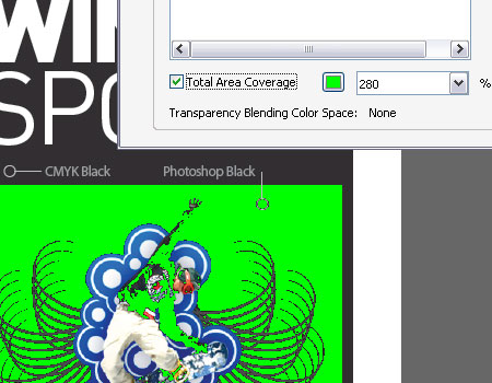
Issue Two, total ink coverage is 300%
Export your design as a PDF as use the Adobe Acrobat Output Preview tool to check over the file, if you turn on the Total Area Coverage option it will highlight areas with over 280% ink coverage as a potential overinking problem.
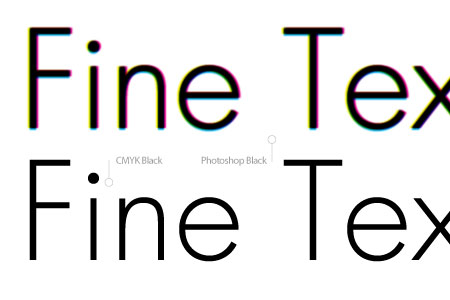
Issue Three, fine text will become fuzzy and illegible
If you have created text in Photoshop with the default black colour, particularly small typesizes or fine serif fonts, chances are they will return from the printers as very blurry or fuzzy and possibly missing any fine areas of type.
The reason being the four sets of ink are being placed over the same area, along with any slight mis-registration causes a loss of detail mostly noticeable on these fine areas.
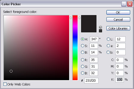
The solution for all three problems is to ensure you always select the correct black in Photoshop by entering the appropriate numbers in the Colour Picker.
Cyan – 0%
Magenta – 0%
Yellow – 0%
Black – 100%
By entering this combination you are specifying that you only want to use 100% of black and none of the other colours for this area of colour, resulting in the single pass of ink on this area.
CMYK Black Is Not Quite Black
CMYK black, or the 100K mentioned previously is great for text, allowing for a crisp and sharp reproduction. On large areas of flat black however, 100K doesn’t really have much impact as black, more as a dark grey, especially when uncoated.
The solution to this is to add a little extra colour to the mix, this is known as creating a Rich Black. The two most common Rich Blacks are those adding Cyan or Magenta.
Rich Cool Black
Cyan – 40%
Yellow – 0%
Magenta – 0%
Black – 100%
Rich Warm Black
Cyan – 0%
Magenta – 40%
Yellow – 0%
Black – 100%
There are many more variations floating around, including 60% rather than 40% and some using a combination of all four colours.
Rich Black should ideally only be used on blocks of black and large titles as the two coats of ink will cause the problem outlined in issue three above on normal sized text.
Don’t Ever Do This
One point to remember is never use Registration Black on anything apart from printer’s marks such as crop and registration marks. Registration Black is a 100% mix of all four inks and should not be used at all on content items, artwork containing registration black would likely be rejected by the printer.
The Five Blacks Summarised
CMYK Black – 0C 0M 0Y 100K
The ideal black for text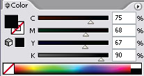
Photoshop Black – 75C 68M 67Y 90K
Rarely used, sometimes called upon as a form of Rich Black.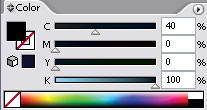
Rich Cool Black – 40C 0M 0Y 100K
Rich black with a slightly cool blue tint.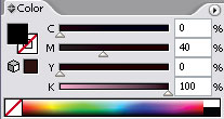
Rich Warm Black – 0C 40M 0Y 100K
Rich black with a slightly warm red tint.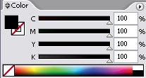
Registration Black – 100C 100M 100Y 100K
Used only for crop and registration marks.

No comments:
Post a Comment